Just For Men
Developing an intuitive, and contemporary e-commerce platform
Check Live Product:
Hats Worn
UX Research • Stakeholder Management • UX Writing • Accessibility Design • Visual & Interaction Design
Honey Mehta, Ashish Konkankar
2 Product Managers, 5 Developers
Collaborators
Platform
Mobile First, Web Responsive
Timeline
6 months | Dec 2021 - May 2022
Context
Just for Men is a brand that understands the importance of confidence. It's a feeling that can make or break your day, and it all starts with your appearance. That's where Just for Men comes in - they offer a range of hair care products designed specifically for men who want to look and feel their best.
Just for Men came to us with a big challenge!
Despite having a loyal customer base, JFM's website was outdated and difficult to navigate, causing customers to struggle finding the products they needed.
Time for a complete overhaul!
So, from this brief we posed a question
How might we develop an inclusive, intuitive, and contemporary e-commerce platform that caters to JFM's multifaceted clientele?
Introducing the New and Improved Just for Men
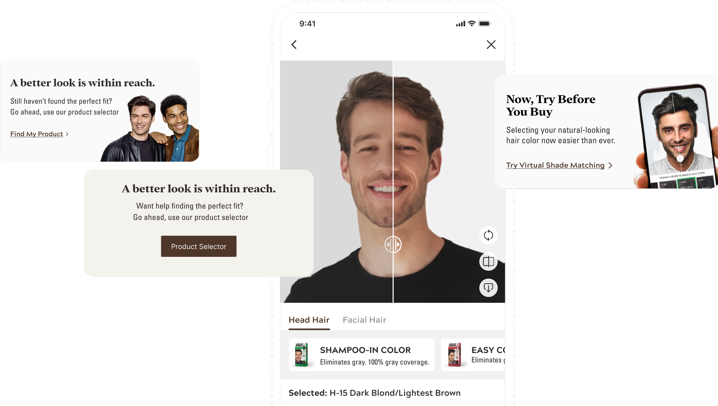
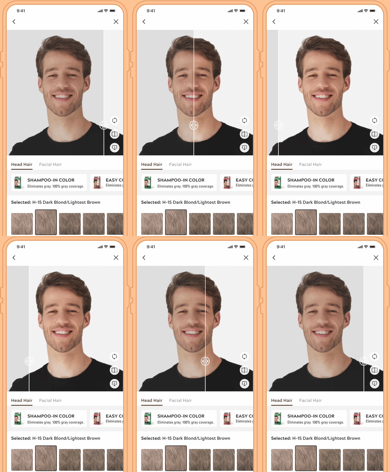
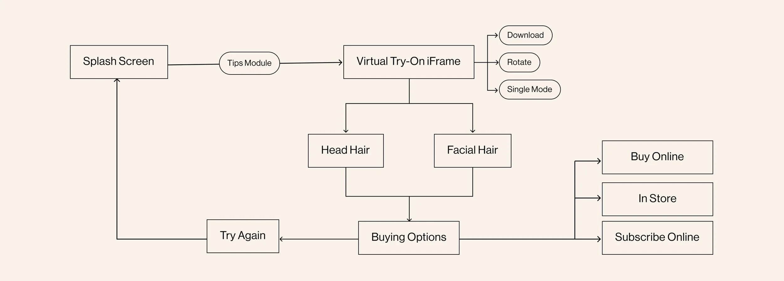
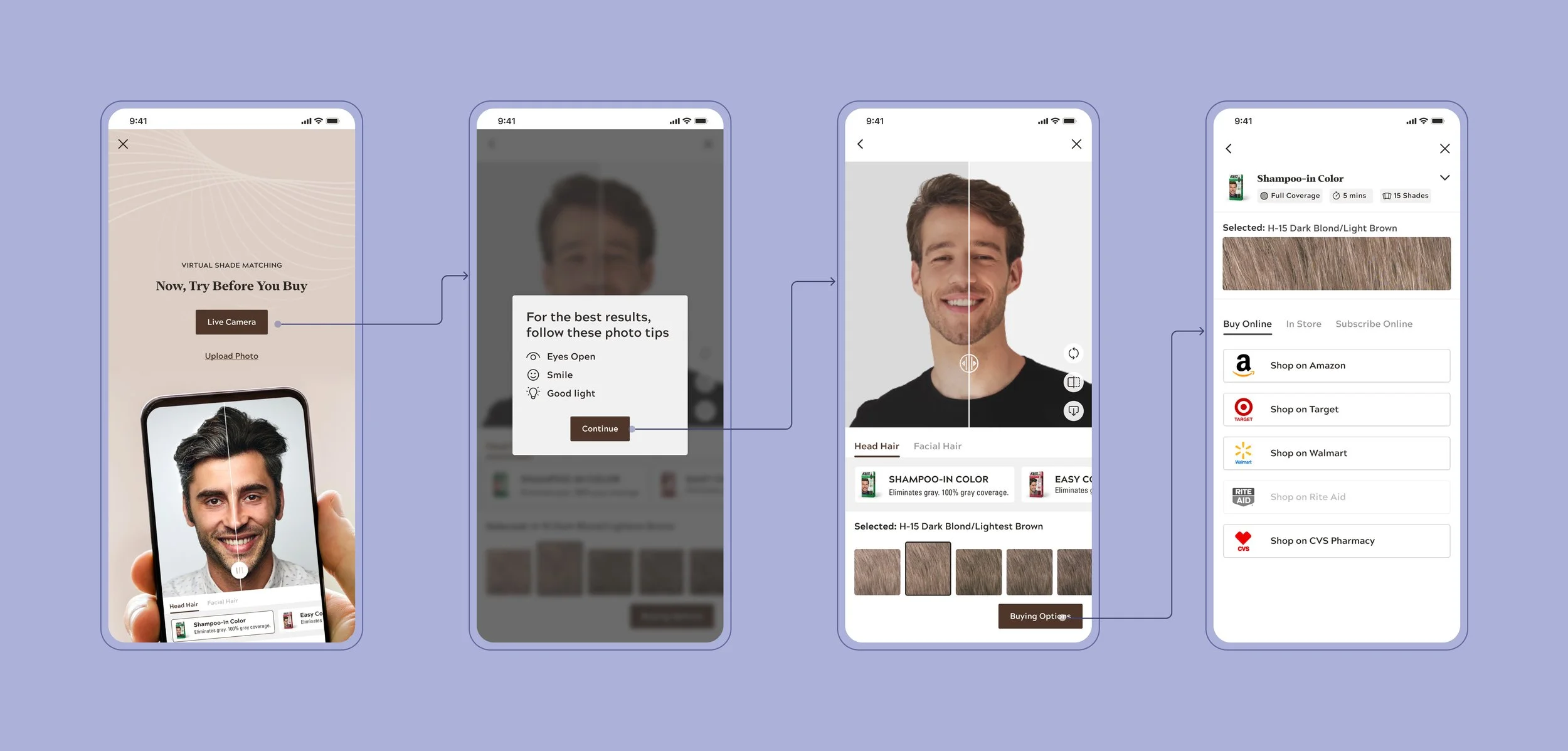
Virtual Try-On
Increase confidence amongst customers to make informed decisions while selecting shades
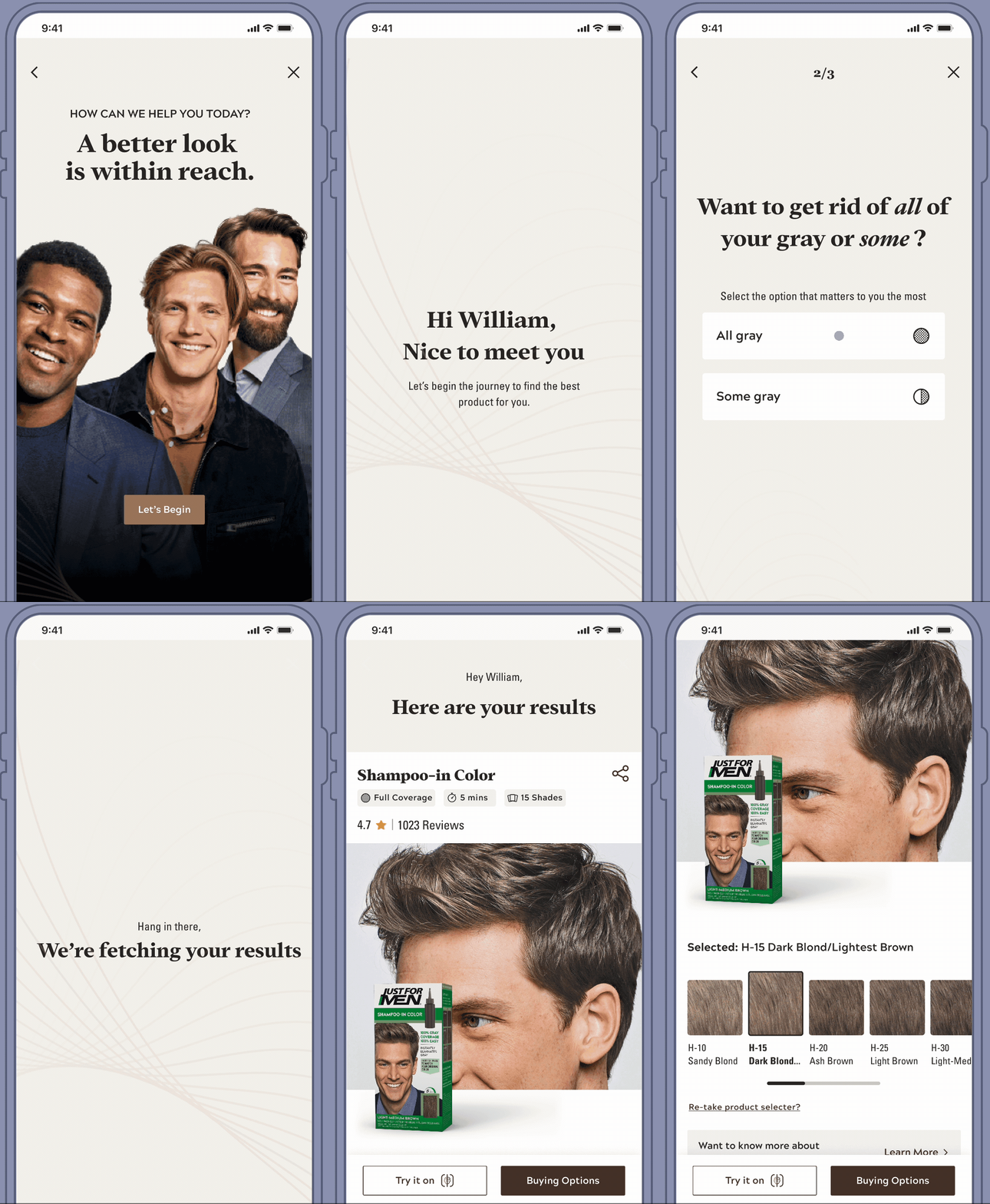
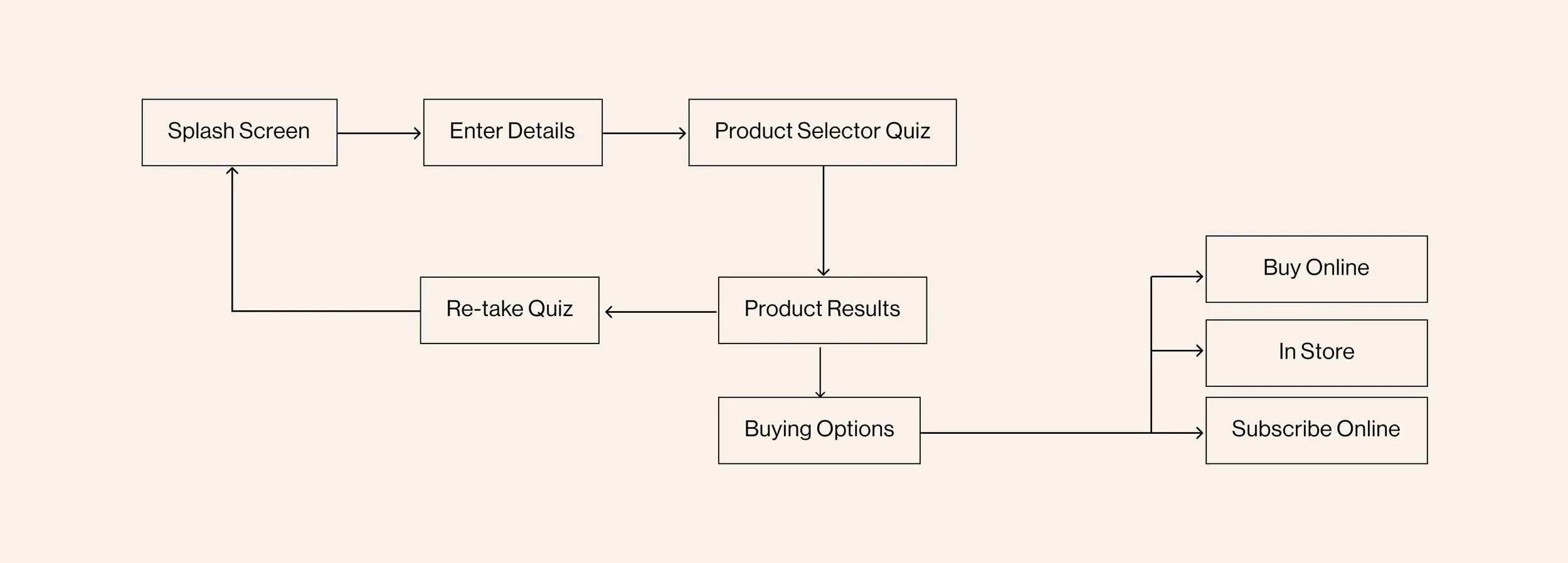
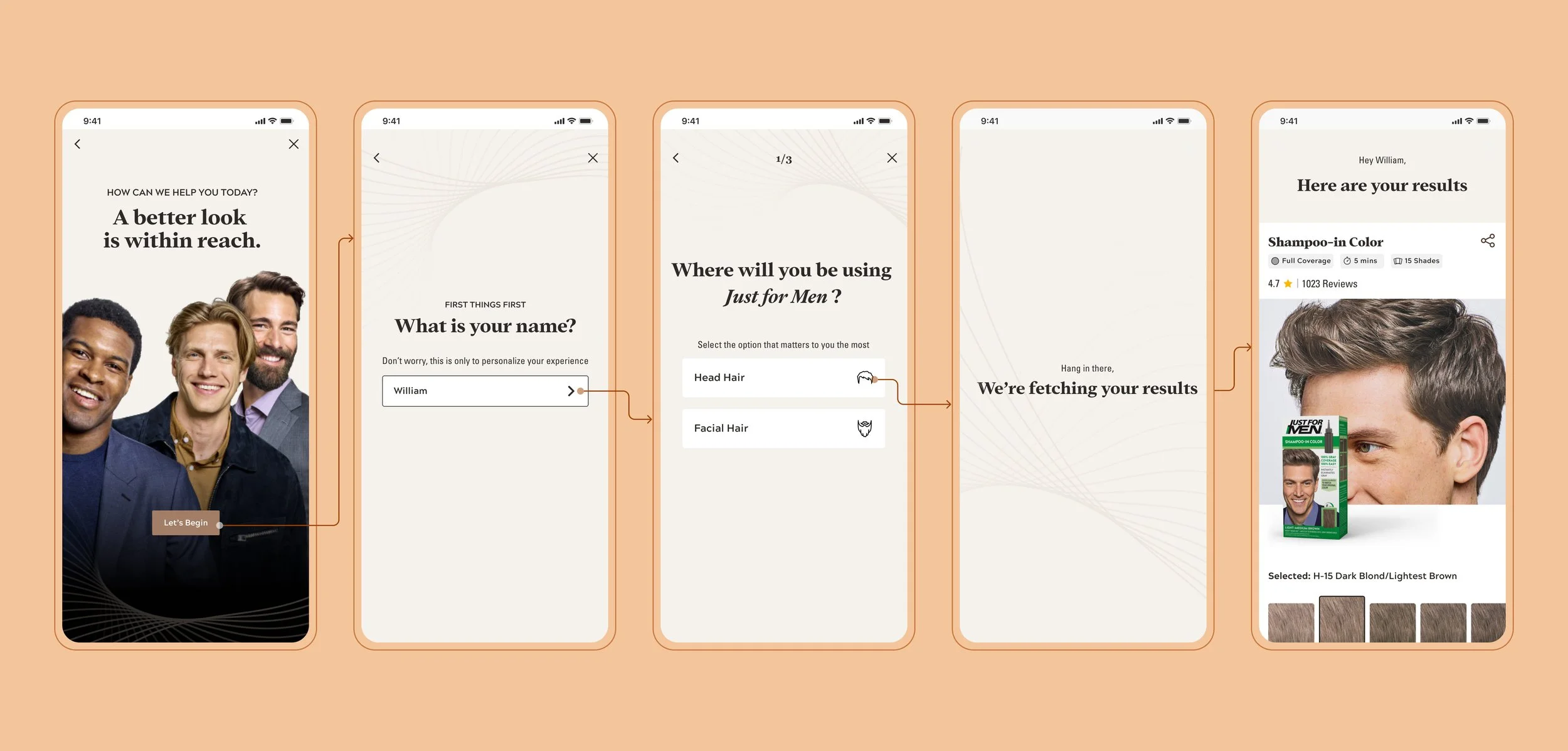
Product Selector Quiz
Empower customers to personalize their shade selection based on their individual needs and preferences
Let’s go behind the scenes of Just for Men's redesign
Uncovering the research methods that led to a more accessible and user-friendly E-commerce platform.
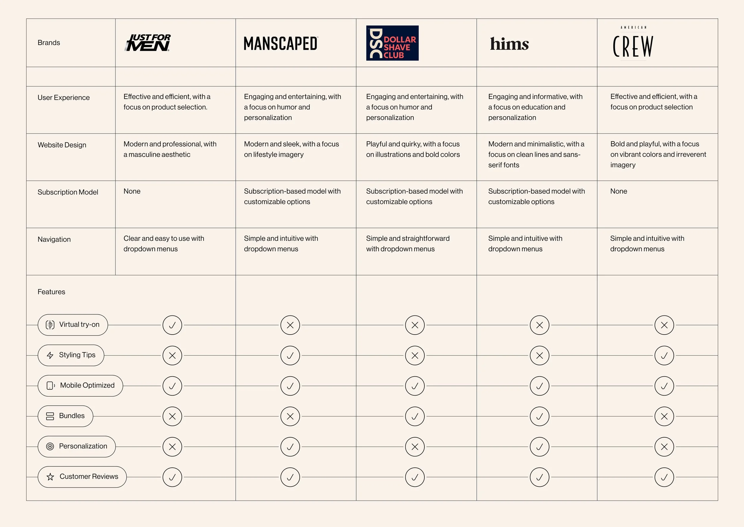
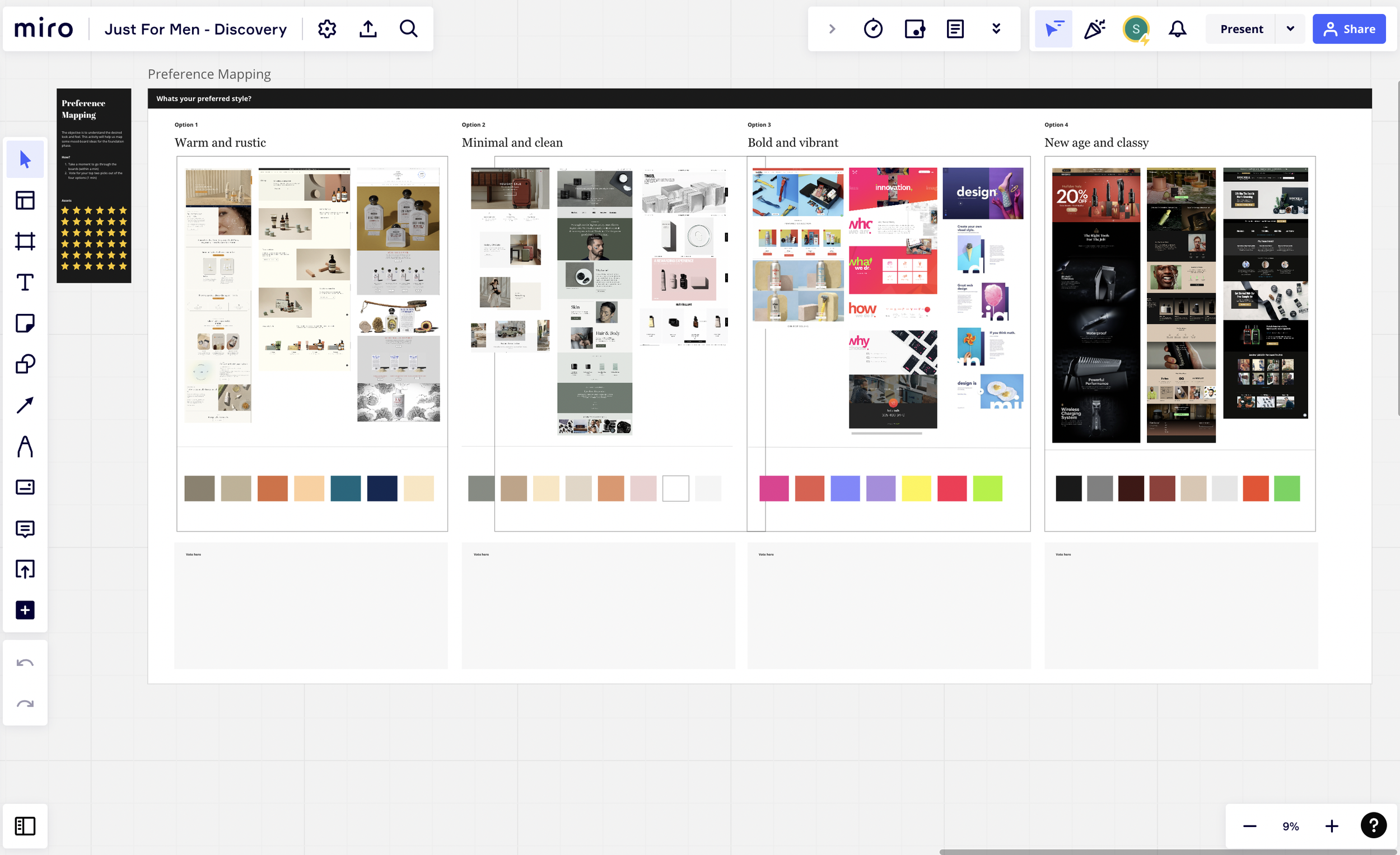
Competitor Analysis
We conducted a comprehensive competitor analysis that provided a solid foundation for understanding the brand's position in the market and identifying opportunities for innovation.
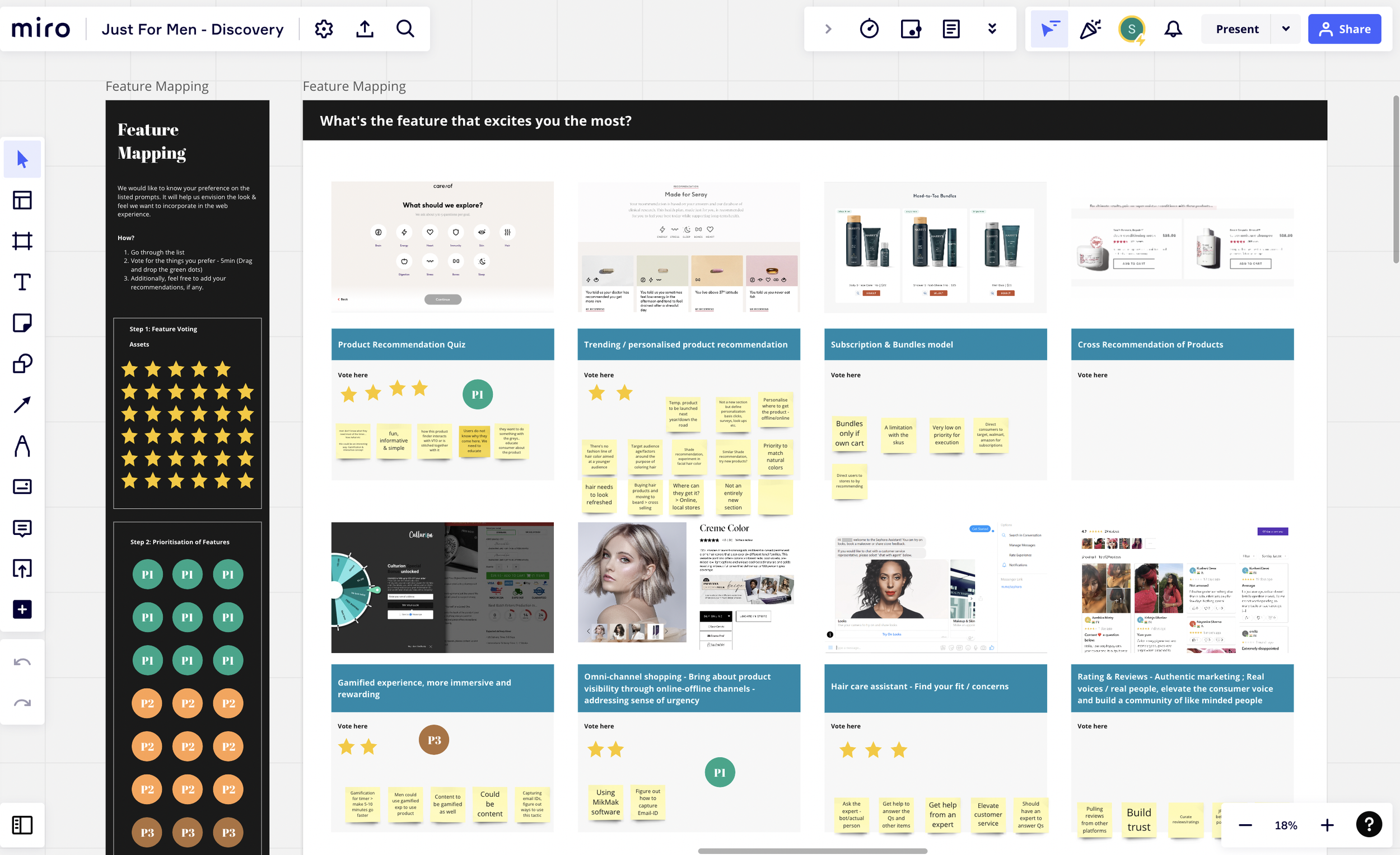
Feature Mapping
Through our feature mapping process, we thoroughly analyzed JFM's current offerings to identify areas where the brand could potentially innovate and stand out in the market.
We worked closely with the JFM team to align on their vision and goals for the redesign, ensuring that our recommendations were tailored to their specific needs.
Disclaimer: Some assumptions were busted!
A small detour - Do we really need a rebrand?
We initially suggested a rebrand in terms of colors and tone of voice to JFM.
With some direction from the client, we ultimately recognized the importance of maintaining their established identity among its professional, masculine audience.
As we continued to design, we kept this audience top of mind
So, who are these people we are designing for?
The Maverick
The Maverick archetype embodies a daring and adventurous spirit, valuing independence, freedom, and pushing boundaries.
They seek products that allow them to maintain their individuality while still achieving their desired look.
The Classic
The Classic archetype represents a refined, successful, and sophisticated persona who values quality and professionalism.
They are discerning consumers who are willing to invest in products that help them maintain a polished appearance.
Key Insights
Now what does all of this research mean for the redesign? Let's delve into the pivotal findings.
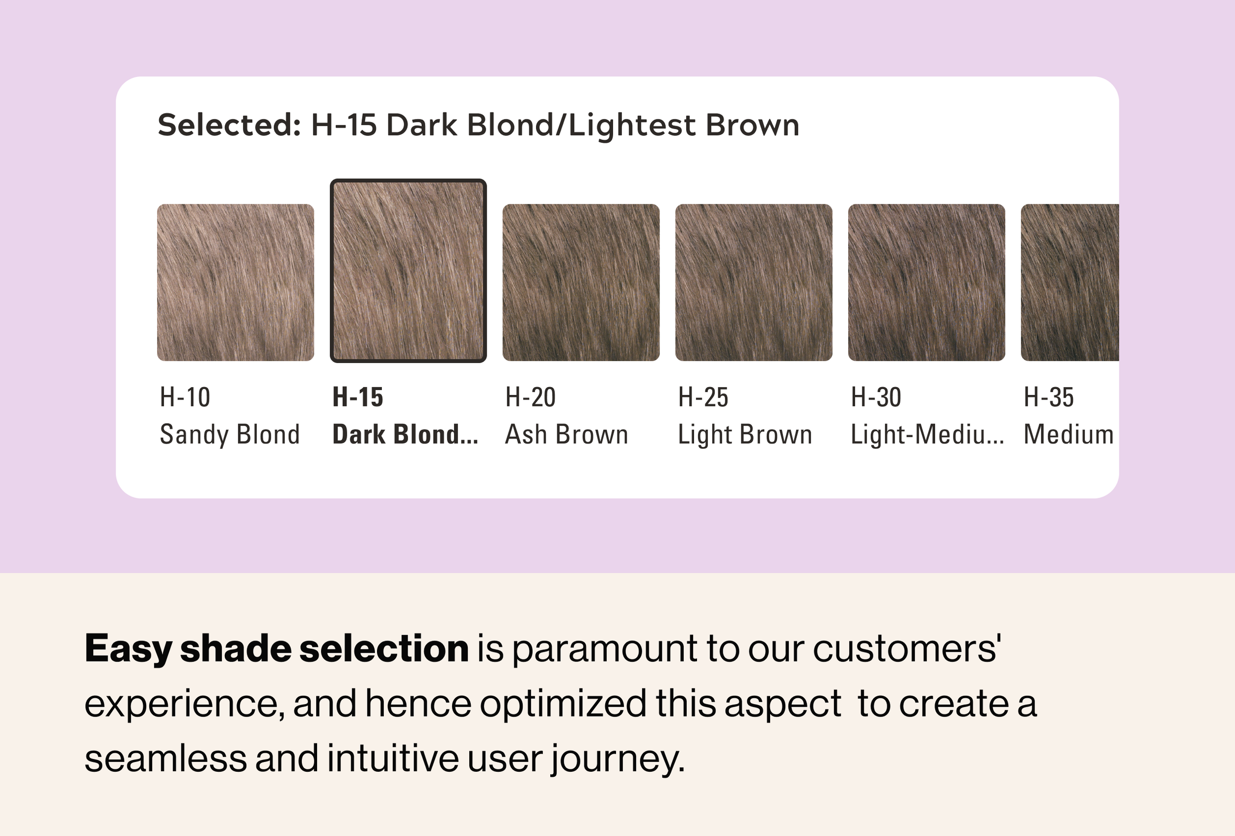
Personalization
Tailoring the shade selection to customer needs
Omni-Channel Experience
Shop wherever and however you want
Real customers, real results
Social proof and user-generated content to increase credibility
Research based solutions
Highlighting the high quality ingredients and R&D efforts
From early UI explorations to final designs
Building the experience using “Jobs to be done” framework
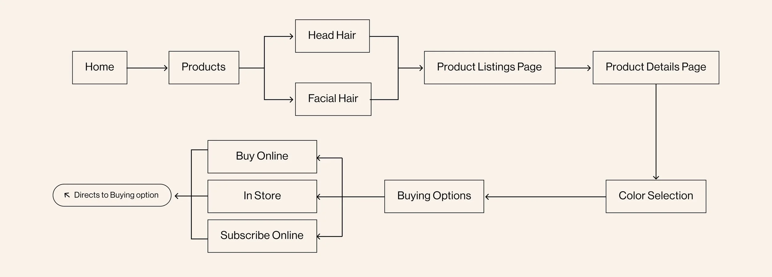
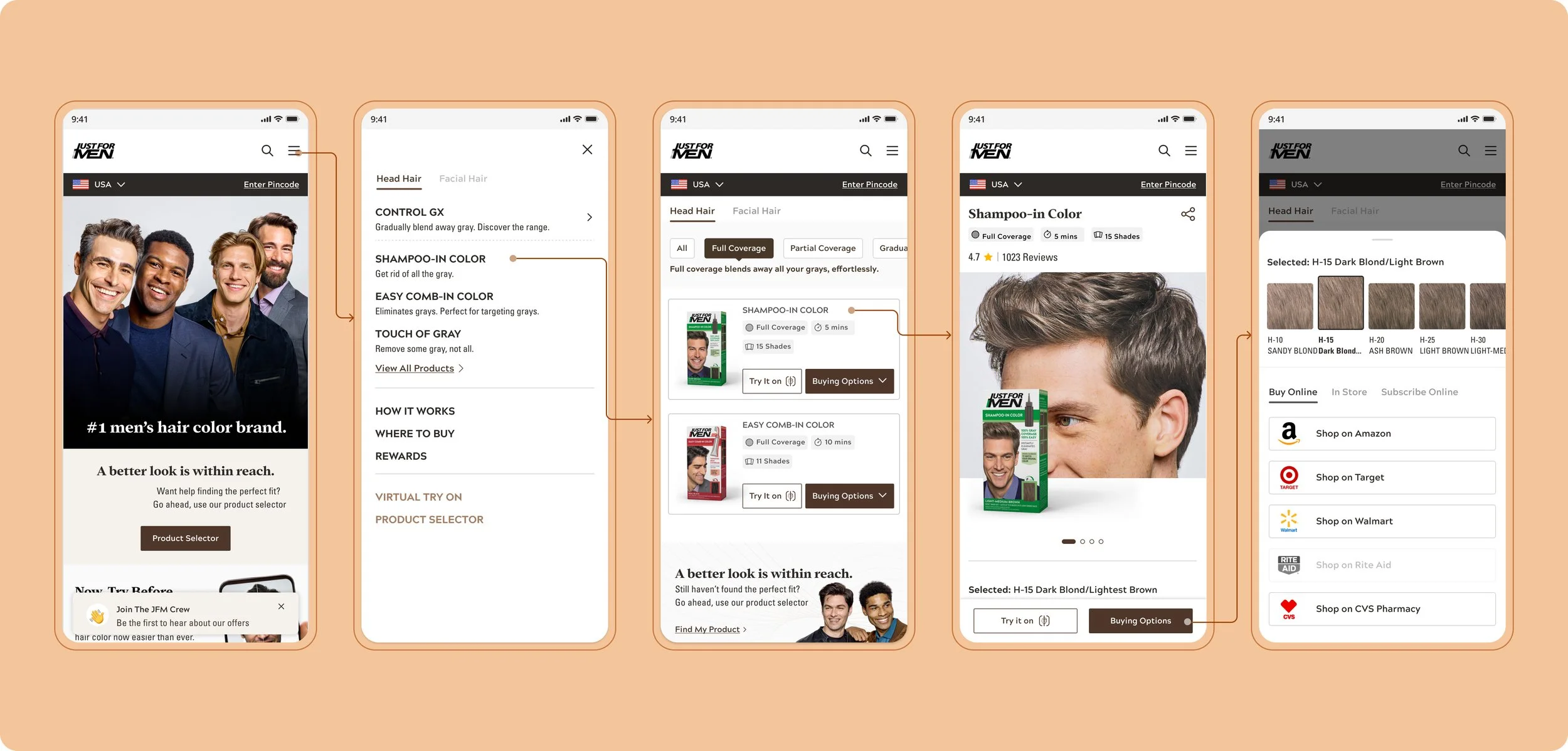
User Job: Path to Purchase
When I visit the JFM website, I aim to discover all of the available options that align with my unique needs and preferences, so that I can confidently make an informed purchase decision.
User Job: Virtual Try-On
Before buying a product, I want to virtually try the shade on so that I get a realistic representation of how each hair coloring shade would look on me before making the purchase
User Job: Product Selector
When I visit the Just for Men website, I desire a quiz that asks me relevant questions about my hair type, skin tone, and personal style, so that it can effectively match me with the most appropriate hair coloring shade.
Let’s take a closer look to the solution
Breakdown of the design decisions that brought the Just for Men experience to life
We faced a few challenges along the way
Making the color palette accessible
JFM’s color palette was dated and inaccessible as it was based on print colors and didn’t translate well in digital platforms.
We extensively researched alternative color palettes that would refresh the website's look while maintaining the brand's identity and improving accessibility.
The revamped colors transformed the website's aesthetics and resolved accessibility issues, providing a visually engaging and inclusive user experience.
Before
After
The lessons learnt: From Frustration to Elation
Learnings and Impact
Efficient Dev Handoff: Dev Clear and concise dev handoff reduced back & forth and sped up the launch.
Prioritizing website performance optimization: Faster load times and smooth interactions, resulted in decreased website load time by 33%, resulting in a 15% increase in page views and a 12% decrease in bounce rates.
More Projects
Product Strategy • 0 – 1 User Experience • Research & Testing
🏆 Award Winning • Speculative • Visual Design • Data Visualization
